.jpg)

Games Workshop and the woes of brand simplification
- amslewis
- Jul 29, 2025
- 4 min read
Last week it caught my attention that Games Workshop, the company famous for bringing Warhammer to many a games table, had rebranded.I was intrigued as the branding changes to their stores had been, in my opinion, solid. They simplified and identified that “Warhammer” was more recognisable than “Games Workshop”.
They made, in my opinion, some solid choices.
But then I saw this rebrand…
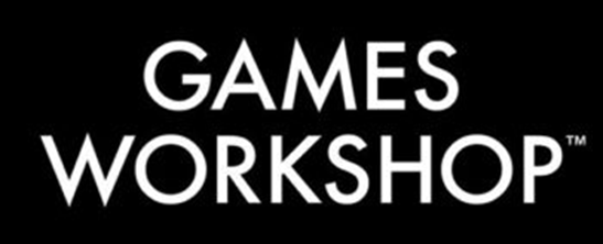
And my palm met my face faster than a Space Marine’s drop-pod smashing into a heretic’s house.
If you’re unfamiliar with Games Workshop, for many, many years they have remained firmly committed to the following logo:

There are problems with it:
It possessed a lot of the overcomplicated markers that many logos of the era had and is very challenging to add to other media. It effectively must have a black background else it wont work. It also has some issues with accessibility with its colour scheme.
There had also been somewhat of a drift away from the theming of their products.
But it was well known and recognisable.
Games Workshop has a reputation for dark and gritty world building.
Their most famous product line Warhammer 40,000 has no real “good guys” or “bad guys” – just pure brutality (with a little comic relief added in by the Orks).
It’s a mixture of sci-fi and darker elements of fantasy.
The branding, and imagery, for these products is (in my opinion) very much on point.


So, what gives with the new logo for the umbrella company being so… boring and devoid of life?
My suspicion here is that Games Workshop decided that they wanted a clean look without too many markers of the in-universe artwork – for corporate documents. And since they’d rebranded their stores to use a simple typeface they likely felt they could repeat the same here:

The typeface used on the stores is closely aligned with the theme of the products.
But the rebrand of the Games Workshop logo? It is devoid of these features.
The simplification of logos has been a long-term trend in marketing in recent years.
Two notable examples being the rebrands of Apple and the BBC in the 1990s


These decisions had clear rationale behind them.
Both Apple and the BBC needed to drastically simplify their brand families, as they had become very complicated.
However, this trend of simplification became widespread.


In many cases this simplification has, indeed, been for the better. You can recognise clear elements of the brand, and they have maintained the personality. Even in cases like Netflix where the logo has shifted personality the logo has maintained the theme of their products.
The same cannot be said for Games Workshop.
It simply is not recognisable. It carries none of the heritage of a 50-year old brand, and none of the personality of games workshop. It even carries the risk of getting lost in documents. It would be easy to miss in many cases.
The sad thing is that there’s no shortage of ideas out there. I found this example on a random reddit thread:

Sadly the poster has since deleted their details from the thread – so I can’t credit them.
But they’ve clearly captured the styling of the text, whilst bringing the logo into a format that is more aligned with the heritage of the brand and its styling.
Frankly, it's not far from what I would have done (I would have kept the triangular A personally).
The trick Games Workshop has missed here is that there were distinctive elements of the typeface that they could have leant on to keep some of the personality of the original. The triangular A and the distinctive W, M and P would have been a great starting point.
They could have also leant more into the Warhammer brand and simply rebranded to Warhammer and that would have been fine as well.
When I look at logo design I often refer to similar guidelines used in modern day vexillology.
Is your logo recognisable at a distance, or at a small size.
Not using too many colours.
If the text is needed to recognise the logo, then the logo isn’t doing what it should.
These are guidelines of course and do not need to be followed rigidly. But, ultimately, the brand needs to immediately be recognisable. Take, for example:

The logo is instantly recognisable, and can be utilised in a myriad of ways.
What surprises me so much about this is that Games Workshop have historically been very good at logo design. Just look at the icons for the in-game factions:
All distinctive, all immediately recognisable to the universe, and all showing the personality of each faction.

And when you look at the logos for each “department” on their jobs website, they’re genuinely fantastic:

I’m completely in love with the customer service icon.
There’s always some level of backlash or disagreement when it comes to logo design – as there is always a level of subjectivity involved. But I feel like the reason this logo has gotten such a significant backlash is that we’re used to Games Workshop’s typically high standards in design.
Ultimately, this is a lesson in how not to do a simplification of a brand.
- Never forget your roots.
- Be recognisable.
- Think about your brand voice.
- Don’t be ashamed to stand out from the crowd.


Comments